Visualizing and Analyzing Retention Cohort - Product Growth
Chapter 6 : Mastering Retention: Visualizing and Analyzing Cohort Data for Lasting Growth
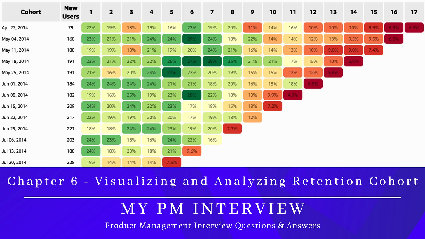
Understanding how users stick around is a core part of product management and growth strategy. While cohort charts give you a detailed view, turning them into line charts can make the data much easier to interpret and act upon. Let’s break it down step by step — from creating the line chart to exploring individual cohort curves.
📊 1. Creating a Line Chart from Cohort Data
Why Turn Cohort Charts into Line Charts?
Cohort charts (especially heat maps) are great for spotting patterns, but they can quickly get overwhelming. A line chart simplifies the view, making trends clearer and easier to communicate.


